

My Portfolio Website Journey: From 1.0 to 2.0
From 1.0 to 2.0: Transforming My Portfolio Website and My Web Development Journey


Table of contents
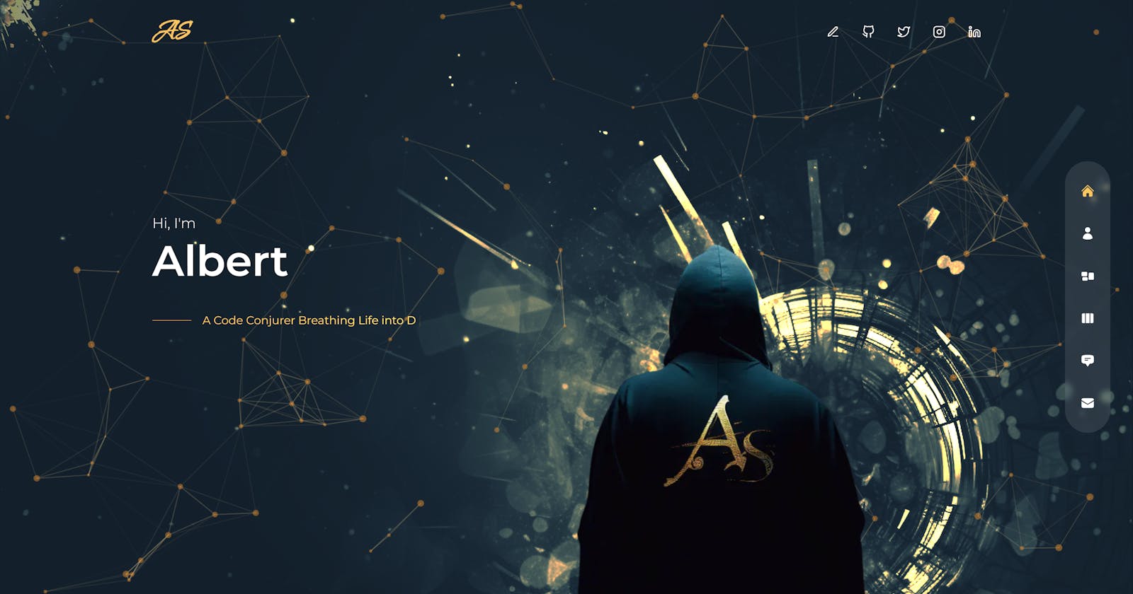
So, I recently gave my portfolio website a much-needed makeover – we're talking about upgrading it from version 1.0 to 2.0. This project has been an absolute blast, and I'm excited to share my experiences, thought process, hurdles, and the tech choices I made, along with all the cool stuff I learned along the way. It's not just about my website's evolution; it's about my journey of growth, both as a developer and as someone who loves to tinker with web development. Join me in this article as I spill the beans on all the ins and outs of this web creation!
The Why
Alright, so why did I dive headfirst into this portfolio website makeover? Well, there were a couple of good reasons behind it.
Firstly, my initial portfolio version 1 was a bit of a pain to handle. The content management system (CMS) felt like a labyrinth, making it a herculean task to add new content. To add salt to the wound, it even played a little hide-and-seek with my data, causing me to lose some precious work—twice! But don't worry, I'll spill the beans on these data dramas in a bit.
And secondly, who doesn't like a fresh look? It was high time to give my portfolio a facelift, upgrading the tech stack, and just making it all-around snazzier. So, grab your coffee and get comfy, because I'm about to take you on a ride through the 'whys' and 'hows' of this thrilling transformation.
Tech Stack
Now, let's talk about the tech stuff that makes this project tick:
Nextjs
Nextjs is my go-to framework when it comes to building applications. With the recent release of version 13, it's become even more amazing. Imagine this: React Server components, simplified data fetching, intuitive Layouts, Route groups, and built-in SEO support – all in one package. These features are like a siren's call, drawing me to Next.js for this project.
Sanity.io: The Unsung Hero
Sanity.io, my go-to headless CMS, plays a pivotal role in my tech stack for several reasons:
Seamless Integration with Next.js: It effortlessly syncs with Next.js, allowing me to maintain a single project repository.
Effortless Deployment on Vercel: There's no need for separate deployments; it seamlessly deploys alongside Next.js on Vercel.
Content Lake Magic: It ensures data integrity by storing and syncing data in the cloud, sparing me the data loss hassles I experienced with my previous CMS.
Built-in Support for Image Uploads: Unlike my previous CMS, which required third-party services like Cloudinary for image uploads, Sanity handles it in-house.
GROQ Query Language: Data retrieval is a breeze thanks to the powerful GROQ query language
Sanity.io's seamless integration and efficiency have filled the gaps I encountered with my previous CMS, eliminating the need for managing multiple repositories, separate deployments, and third-party image hosting.
Exploring Valuable Libraries
In my project journey, I had the pleasure of working with some remarkable libraries that enhanced the overall quality of my work. Allow me to introduce a few of these gems:
1. React Hook Form
Managing contact form data and validation, along with handling submission logic, was made effortless by the incorporation of the React Hook Form. Its inherent capacity to prevent unnecessary form rerenders not only contributes to efficient performance but also streamlines the user experience.
2. React Email
The often frustrating task of crafting email templates in code becomes a breeze with React Email. This library not only provides the freedom to utilize fancy CSS styles but also seamlessly integrates with Tailwind CSS, the framework I chose for styling in this project.
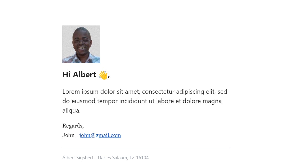
A sample mail in my inbox as created by react email
3. Resend
Resend, a companion package from the same creators of React Email, complements its functionality harmoniously. This duo simplifies the task of sending emails, ensuring a seamless and efficient email communication process.
4. Framer Motion
Framer Motion, an extraordinary animation library, played a pivotal role in bringing life to my website. The finesse and versatility of this library are truly beyond words, as it powered all the captivating animations and seamless transitions on my platform
5.0ther Libraries
Some honorable mentions include:
SwiperJS: For captivating carousel sliders.
React Icons: To bring life to icons that make your experience richer.
React-simple-typewriter: Adding typewriter effects.
React-tsparticles: Enchanting animations with particles.
React-hot-toast: Instant feedback notifications to the user
The Process
Here is my is a brief intro to my dev process:
Initial design & UI development
My development journey started with ideas from my past work and a YouTube video by Cristian Mihai. These inspirations came together to shape the design.
I used TailwindCSS to make the user interface look good and work well on different screens.
Challenge
The Mobile Navigation Challenge
My first hurdle appeared after deploying the project. It seemed fine when I tested it in Chrome dev tools, even on mobile settings. But when I checked it on my actual mobile, the bottom navigation was cut off, making it impossible for users to navigate.
Understanding the Problem
I initially thought it might be a problem with my phone, so I tested it on various devices through BrowserStack, and the issue remained. After some research, I discovered that the problem was due to mobile browsers not accounting for their toolbar's height. It turns out, the use of '100vh' was the root cause of the problem. A helpful Stackoverflow article confirmed this.
Finding the Solution
I first tried using an npm package called react-div-100vh, but it didn't work well with my app. So, I decided to understand its implementation and create my own solution.
In my search for a solution, I stumbled upon a Google I/O 2022 video showcasing new viewport units: 'lvh,' 'svh,' and 'dvh.' These units provided the answer I needed. I adopted the 'svh' unit, and everything fell into place, resolving the navigation challenge.
Sanity Integration
After the development of the UI with Tailwind, it was time to integrate the website with dynamic content from Sanity which wasn't much of a hustle as it can be embedded directly in my Next project this simple process just required the definition of schemas and only a few more setup such as querying the API using Groq in my Server components and everything looked good finally the website has my custom dynamic data.
Challenge
The Layout Mystery
In the latest Next.js App Router, they introduced something called layouts. These layouts are like a shared design for multiple pages. They keep things smooth and don't rerender when you switch pages. But there was a twist when I added Sanity into the mix: my main layout showed up on the Sanity dashboard, which wasn't what I wanted.
Understanding the Issue
Next.js has this default layout that affects all the pages, even if you create custom layouts for specific pages. So, my main layout, with its unique Navbar and footer styles, was taking over the Sanity dashboard, which wasn't the plan.
Finding the Fix
The solution seemed simple: get rid of the main layout on the Sanity dashboard. But the actual steps were a bit tricky.
A Conditional Rendering Approach
I stumbled upon this method in a GitHub issue discussion. It suggested conditionally displaying content within the main layout based on the current page. However, this technique required wrapping the page's content with a custom provider, as demonstrated in the following code snippets.
"use client";
//components imports
import { usePathname } from "next/navigation";

export const LayoutProvider = ({ children }) => {
  const pathname = usePathname();

  if (pathname && pathname.includes("/studio")) {
    return (
      <>
        <main>{children}</main>
      </>
    );
  }
  return (
    <>
      <TopLeftImage />
      <Nav />
      <Header />
      <main>{children}</main>
    </>
  );
};
export default function RootLayout({ children }) {
  return (
    <html lang="en">
      <body>
       <LayoutProvider>
          {children}
       </LayoutProvider>
      </body>
    </html>
  );
}
This approach worked, but it had a drawback. The wrapper needed to be a client component because it relied on the usePathname hook, which meant it couldn't take advantage of Server components. This limitation prompted me to explore alternative solutions.
Route Groups Discovery
I stumbled upon the concept of Route Groups through a helpful response on StackOverflow. Intrigued, I delved into the Next.js documentation to learn more. The documentation explained that Route Groups could be used to create multiple root layouts,
I decided to give it a try, and it turned out to be the perfect solution I had been seeking. I organized my project using two separate route groups, one for the CMS and the other for the web. I added distinct root layouts for each, all while retaining the benefits of Server Components. This approach aligned perfectly with my goals, below is the screenshot of how I restructured my project

SEO and Performance Optimization
Following the development phase, my immediate focus was on optimizing the application's performance and improving its SEO metrics. I found Next.js 13 to be a great ally in achieving these goals.
One of Next.js 13's standout features is its Metadata API. This powerful tool allows you to define essential metadata for your application. I made the most of it by using both Config-based Metadata and File-based Metadata. These components served a crucial role in enhancing various aspects of the application.
File-based Metadata enabled me to set up essential information like open graph images for my static routes, as well as manage directives for robots and sitemap files. This played a pivotal role in improving SEO and ensuring that search engines could efficiently crawl and index my site.
However, what truly stood out was the ability to generate dynamic Open Graph (OG) images using the ImageResponse constructor. I harnessed this feature to create dynamic images for my application's dynamic paths. This approach significantly improved the visual appeal of my content, making it more engaging for users.
To illustrate the impact of dynamic OG images, here's a sample screenshot showcasing the results on such dynamic routes:
By leveraging Next.js 13's Metadata API and dynamic OG image generation, I was able to enhance both the performance and SEO metrics of my application, creating a more visually appealing and accessible experience for my audience. Here is a snapshot of my final score

Deployment
To conclude, I completed the final step in my web development journey by securing a custom domain through Hostinger and seamlessly integrating it with Vercel, a platform specifically designed for the efficient deployment of Next.js applications. The entire process has been both educational and rewarding, and I'm excited to share the results with you.
Without further ado, here's the Link to the website I've been working on also here is the video demo, I invite you to explore it, experience the changes, and share your valuable feedback with me. Your insights and comments are highly appreciated and will help me refine and enhance the website further.
Thank you for joining me on this journey, and I look forward to hearing your thoughts on the website. If you have any questions or suggestions, feel free to reach out. Your feedback will be a vital part of this ongoing project.